To all our readers,
MKandcompany Interior Design and Decoration can now be found at our new blog address;
http://mkandcompanyinteriordesign.wordpress.com/
Please visit us at our new blog home.
Thursday, February 23, 2012
Monday, February 20, 2012
Designing a Closet for a Man - Basics
Weather it be a standard sized closet or a entire room as a closet origination is the key.


A man's wardrobe consists, for the most part, of suits, shirts, ties, jackets, sweaters, and casual wear. You won't find the wide variety of items or lengths that are common in a woman's wardrobe.
Although many feminine equivalents to a man's clothes do exist, the issue of importance is a matter of space rather than classification. A man's garments are usually longer than a woman's (except for dresses). This fact leads to a significant, though subtle, element affecting the organizing of a man's closet: Space can be used more efficiently in a man's closet. All the room in a man's closet can be double-rodded, since nothing is longer than a suit coat or shirt. And the height of the shoe shelves need not extend above the height of his dress shoes or cushioned running shoes.

To organize any closet, the first step is to establish a set of standard operational procedures, or handling instructions, for the items that will go in the closet. Do not deviate from these guidelines; without standard procedures, you cannot maintain control of your closet.
Remove accompanying belts from slacks. Otherwise, the garments may be stretched out of shape. Belts belong on a belt rack. When hanging slacks, match the inside seam to the outside seam at the bottom edge. Hold the slacks at the bottom, and the crease line is defined. Buttoning or zipping the slacks misaligns the crease. Simply follow the crease line to the waistband and gently mold the zipper and placket into a fold. Then fold the slacks near the middle of their length and insert them onto a hanger, keeping the fold in the center of the hanger. You may prefer to hang your slacks by their full length, which calls for a type of hanger known as a clamp hanger. But be warned: These hangers might mar the cuffs of slacks by leaving pressure marks that are difficult to remove.


When hanging shirts, fasten the top button, perhaps the top two buttons, or, best of all, every other button for the entire length of the garment. This will keep the occurrence of wrinkles and cock-eyed collars to a minimum. After putting the garment on the hanger, place the hanger on the rod so that all hangers face the same direction. Perhaps the worst habit you can get into is deliberately pulling a garment from its hanger. Instead, remove the hanger from the rod and then unbutton the garment from the hanger. Put the empty hanger in the workspace area.
The question of what to do with seasonal clothes usually arises sometime during the organizing process. It may seem a waste of space to have all your winter clothes hanging in your closet in the middle of July and vice versa. But storing out-of-season clothes separately can be bothersome and time-consuming, involving dry cleaning, mending, folding and packing, and then finding and unpacking the garments later. The choice of which storage method to use depends on your personal preference as well as the amount of space in your closet and the availability of extra closets elsewhere in your home.
Make sure that all supports and appointments are kept off the floor. This adds an extra convenience: You can run the vacuum cleaner or dust mop into every corner, reaching every inch where dust collects.
Each part of your closet can be designed in a variety of configurations. You must determine which aspects of the given designs are most productive and effective for your own circumstances. Note the alternative arrangement shown in the illustration below. Coming up with an alternative design requires some thought and speculation. The time spent designing an alternative is often worthwhile, since the result may be a truly innovative finished product. The best way to get your creative juices flowing is to evaluate and compare several closet renovation projects and their special features. Eventually you'll arrive at an arrangement that satisfies your own personal needs.
©2006 Publications International, Ltd. A different daily routine for each person dictates an alternative design, in this case adding drawers and reconfiguring the shelves.
Links: California Closets, Closet Envy
Links: California Closets, Closet Envy
Of course, there are occasions when no amount of refiguring or diagramming can increase your closet's capacity enough to hold all your clothes. But if you adhere to the principles of organizing, your closet will at least provide the most storage space possible under the circumstances.
©Publications International, Ltd.
Tuesday, February 14, 2012
Products to Inspire - 3 products we are loving
What's in a Paper Envelope for your iPad?
Papernomad - Love the name.
This is a new company based in Vienna, Austria whose mission is to create items replacing traditional materials with paper.
Their first product to hit the market is an iPad case made of a special paper formulation that is tear and water resistant and flame retardant.


What's in a Letter?
DDB Group, a company based in Singapore has designed modular flat packed alphabet furniture in which the user connects the letter to create a product.
Example, when the letters, T,A,B,L,E are put together you get a "table".

.jpg)

What's in First Impressions?
MOO is the choice and their new Luxe Business cards recently launched is the answer.
Printed on Mohawk Superfine paper, which is triple the thickness and weight of most cards on the market today. If you haven't ordered any of their products, you are in for a treat. With Moo products you can choose from one of their designs or upload your own. Luxe Business cards are the equal to letterpress, and letterpress cards stand alone in the printing world.


Product links can be found here.
Papernomad, DDB Group, MOO
Monday, February 13, 2012
Inspiring Monday
Is "ART" all ways in the eye of the beholder?
Today is a rainy and foggy day in Pasadena, CA. However, we are finding these works of art by Resa Blatman to be very inspiring. Her process is fascinating, and one can just admire them for their beauty or the technic that goes into their creation.
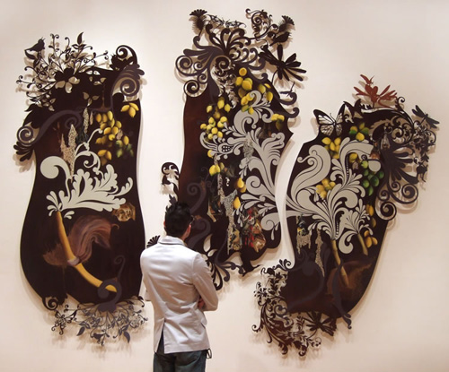


 |
| Red Hot Peevish Birds - Poster for sale |
There is something very magical in all her work. We hope you find them inspiring as well.
artist statement
Over the last several years my work has dealt with nature and fertility. While nature is still an integral part of my work, my primary concern is with current environmental issues and industry's effect on our landscape and natural resources. Some of these issues include mountaintop removal (for coal), hydraulic fracturing (for natural gas), oil drilling, and the Keystone XL oil pipeline project.
I’m fascinated by beauty in art and nature and exploit it in my work. While at the same time, I recognize that the underbelly of beauty and nature is often frightening and grotesque, and I like this as well — I find this contradiction deeply complex and intriguing, especially in its relationship to human behavior, and how we perceive and treat nature. I strive to incorporate this paradox in my work with the myriad elements that I apply to the painting’s surface, such as glass and plastic beads, glitter, Austrian crystals, and thick layers of glue, as well as the painted subject matter. Since 2008, I’ve been making the “cut-edge” paintings, but my recent surfaces have migrated back to a straight-edge format, where I’m drawing and painting the flamboyant elements of the laser-cut edges into the rectangle.
Some of my stylistic references are to art history, including the Renaissance, Baroque, Victorian decorative art, Romanticism, and antique botanical imagery; these influential art movements, combined with my own concepts, elicit painting compositions that are seductive visual feasts of fruit, flora, wildlife, and beauty laced with brooding undertones.
The cut-edge paintings are made on ¼-inch PVC or Plexiglass. I design the patterns on the computer and then have the panels professionally laser-cut. Once back in my studio, I begin the painting process. The cut edges extend the subject matter and pattern of the painting, with insects flittering along the wall and casting shadows for a three-dimensional effect.
Read more at Design Milk: http://design-milk.com/resa-blatman/#ixzz1mHjdIrWV
Friday, February 10, 2012
We ask you...
"Is it Soup or Art?"
Asked by; Lily Tomlin in her one woman stage show titled, "The Search for Signs of Intelligent Life in the Universe."
When looking at a Andy Warlow painting of a can of Campbell's Tomato Soap she asks the question, "Is it Soup or Art, Art or Soup, Soup or Art?"
 |
| Andy Warhol |
Looking at Ted Lotts' small house frames in a chair, we ask you the same question, "Is it Soup or Art?"
Madison, WI-based artist and woodworker Ted Lott created this series of small house frames out of wood while in residency at the Anderson Ranch Art Center in Colorado. A nice comment on the role of traditional craft in the modern world.


He says, “Craft practices are at once defined and restrained by their connections to tradition. Viewing woodworking in the context of objects made with wood; housing, particularly stick frame construction, emerges as possibly the most widespread use of the material throughout the modern world. Utilizing these techniques in a studio based practice, it is my hope to further the conversation on how notions of craft fit into the modern world.”


Read more at Design Milk: http://design-milk.com/ted-lott/#ixzz1m0AOYUjY
Wednesday, February 8, 2012
Little Has Changed - see the before & after
From December 1950 issue of "Better Home and Gardens"
"Kitchens are for Living"
"Our kitchen is the heart of your home. It's where your family gathers after work or after the movies to talk, and to snack, and to read the newspaper. So make your kitchen as livable as it can be. The Glade Porters of Glendale, California, chose cherry colors, patterned wallpaper, natural wood cabinets and added a friendly fireplace. You can too."

 |
| Better Home and Gardens Dec. 1950 |
 |
| Better Home and Garden Dec. 1950 |
Before Updating for the 2012 Lifestyle
When our clients purchased this home in 2010, they became the 3rd homeowner. Before then, little had changed. Along the way the natural wood cabinets and wood ceilings were painted "white". Appliances were upgraded to circa 1960's sleek black models, and an addition of a dishwasher was added. The original wood flooring was covered with sheet vinyl and the old fashion pattern wallpaper was replaced with "white" paint. Even a built-in recessed toaster was installed. Yet, the bones of the kitchen remained intact.
 |
| In the late 60's appliances were changed |
MKandcompany Interior Design and Decoration gives this dated kitchen the respect it deserved by maintaining the original bones and details.
 |
| Today the charm remains |
 |
| Before |
 |
| After |
 |
| After |
 |
| After |
 |
| After |
Credits
Appliances: MD Appliances
Plumbing: George's Showroom
Recessed Lighting: Pasadena Lighting
Decorative Lighting: Rejuvenation Lighting
Monday, February 6, 2012
Table Top Settings
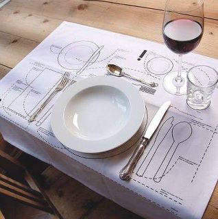
When dressing your table, weather it is be formal or informal, make it interesting looking. We like using different collections of things - this adds much interest. Missed matched silverware and plates can start up a fun dinner conversation. Maybe you have dinner plates that once where your mom's or grandma's, use them - why not? Mix them up with other plates you own.


Notice how MKandcompany Interior Design and Decoration went one step further and used a variety of mismatched chairs.
It's design for today's lifestyle.
Friday, February 3, 2012
Celebrating the Dining - continues -
Let us look at the history -
In the Middle Ages, upper class Britons and other European nobility in castles or large manor houses dined in the Great Hall. This was a large multi-function room capable of seating the bulk of the population of the house. The family would sit at the head table on a raised dais, with the rest of the population arrayed in order of diminishing rank away from them. Tables in the great hall would tend to be long trestle tables with benches. The sheer number of people in a Great Hall meant it would probably have had a busy, bustling atmosphere. Suggestions that it would also have been quite smelly and smoky are probably, by the standards of the time, unfounded. These rooms had large chimneys and high ceilings and there would have been a free flow of air through the numerous door and window openings.
 |
| Typical Dining Room of it's Era |
Over time, the nobility took more of their meals in the parlour, and the parlour became, functionally, a dining room (or was split into two separate rooms). It also migrated farther from the Great Hall, often accessed via grand ceremonial staircases from the dais in the Great Hall. Eventually dining in the Great Hall became something that was done primarily on special occasions.
Toward the beginning of the 18th Century, a pattern emerged where the ladies of the house would withdraw after dinner from the dining room to the drawing room. The gentlemen would remain in the dining room having drinks. The dining room tended to take on a more masculine tenor as a result.
 |
| Table Top Place Setting Adds to the Dining Experience |
Wednesday, February 1, 2012
Celebrating the Dining Room
 |
| "It's a moment in time." Inspired by the original Asian style wall murals in this Dining Room, MKandcompany Interior Design and Decoration has created a space that sparkles and glimmers. "We have respected the past and beauty of the existing architectural elements and wanted the room to have a very luxurious and contemporary European vibe." |

 |
| 2010 Pasadena Showcase House of Design |
Subscribe to:
Posts (Atom)